The evolution of the Audi badge
Nov 2020
THE HISTORY OF AUDI
WHY DOES AUDI HAVE 4 RINGS?
THE AUDI LOGO EVOLUTION
The evolution of the Audi badge
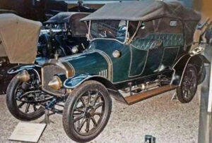
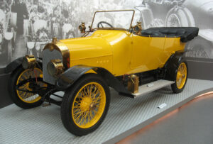
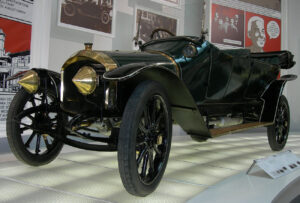
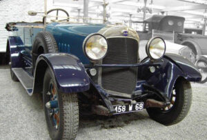
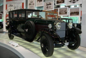
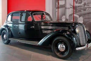
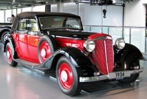
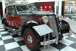
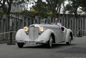
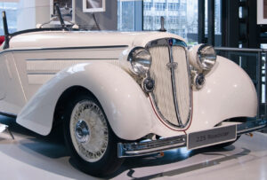
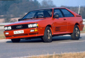
In 1932, four automobile companies merged: DKW, Horch, Wanderer and Audi. These already established auto businesses joined to form Auto Union AG, which would later become AUDI AG. The newly founded company needed a new logo and the four interlocking rings were born. Today, Audi has emerged as one of the leading and premium automotive brands in the world.
1909
Audi’s first, official badge was designed and introduced in 1909. It resembled a solid black triangle pointing down with the number one sign above it and the white cursive wordmark with thick smooth lines along the upper line of the geometric figure. This logo stayed with the automaker until 1932 when the Auto Union was formed.

1932 – 1949
The four interlocking rings symbolised the merger of the four automobile manufacturers. The ring on the left side represented Audi, the next DKW, the third Horch and the fourth Wanderer.
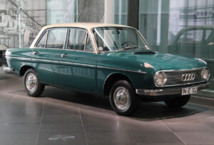
1949 – 1969
In 1949 the four-ring logo was simplified. The brands’ emblems were removed from the badge and replaced by a thin horizontal rectangle, stretching across the rings through the middle, with the capitalised sans-serif inscription on it.


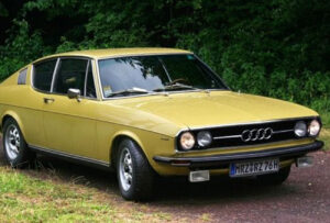
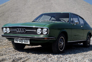
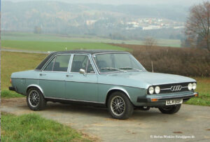
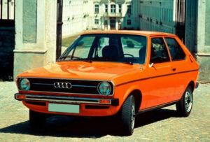
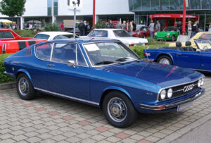
1969 – 1978
Auto Union became Audi in 1969 and the rectangular banner was removed from the logo. Now the emblem was composed of four thick blue rings chained together as a representation of strength and confidence. There was also a logotype created in the same time period — bold white lettering in a custom sans-serif font with the rounded shape of the “D” placed inside the solid black oval. In 1978, the oval turned red and received a thin double white and red outline, which created a better contrast and made the emblem more distinct and brighter.
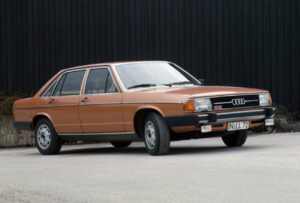
1978 – 1995
Starting 1978, a black oval with white lettering characterised the brand identity. In the 90s, the company once again concentrated on the rings, this time with a three-dimensional look. The two emblems become one in 1995. The logo was composed of a silver three-dimensional ring symbol with an extra-bold red lettering in the same custom typeface under it. The thin and delicate contours of the rings brilliantly balanced the massive wordmark, adding elegance and exclusiveness to the whole image.
2009 – 2016
In 2009 the logo was refined. The glossy rings became bigger and the nameplate smaller. The lettering changed its typeface to a more traditional sans-serif with slightly extended shapes. It was now placed on the bottom left part of the logo, making the four-ring emblem the star of the composition. The new challenge of the decade was that the logo needed to look good not only on paper, but online as well. So, the trend towards simplicity came into play. That’s why in 2016, the four rings became two-dimensional.


2016 – present
In 2016 the logo simplified even more. All three-dimensional effects disappeared, and the iconic symbol was executed in plain black, with no additional lettering. The four rings now have more space in the overlapping areas and look truly powerful and stylish.


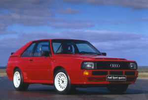
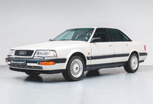
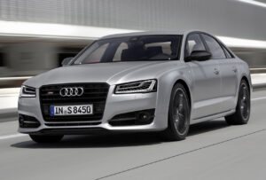
When you choose a car, do you prefer the perfect balance between sporty performance and elegant comfort? Then Audi is your answer. That’s better value – and more luxury – from the number one pre-owned dealership in South Africa. Visit our Citton Cars showrooms and find your dream Audi.