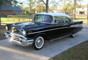
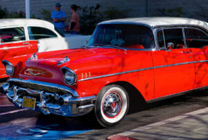
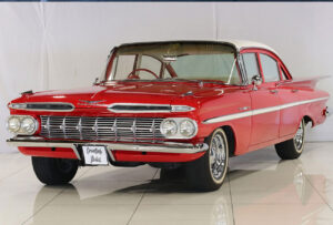
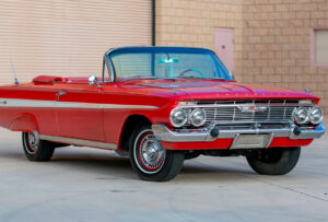
The evolution of the Chevrolet badge
Dec 2020
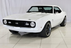
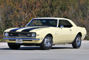
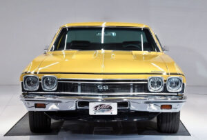
THE ORIGINS AND INNOVATIONS OF CHEVROLET
THE CHEVROLET LOGO EVOLUTION
The evolution of the Chevrolet badge
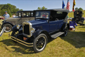
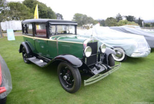
Chevrolet is affectionately known around the world as Chevy. The brand’s logo has its own nickname – “bowtie” – originally designed by William Durant in 1913.
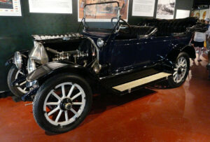
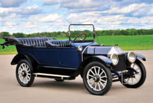
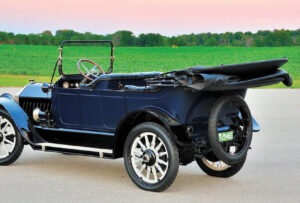
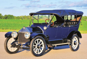
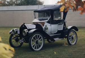
1911 – 1914
The first Chevrolet logo was crafted from the owner, Louis Chevrolet’s signature. The execution was in black, with a distinct, handwritten typography.
The first Chevrolet logo was crafted from the owner, Louis Chevrolet’s signature. The execution was in black, with a distinct, handwritten typography.
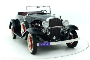
1914 – 1934
This was the first version of the ‘bowtie’ logo. The emblem featured a light blue and white colour scheme with golden edges. The wordmark was written in white and placed horizontally across the logo in a serif font. This gave the design a luxurious look.
.
This was the first version of the ‘bowtie’ logo. The emblem featured a light blue and white colour scheme with golden edges. The wordmark was written in white and placed horizontally across the logo in a serif font. This gave the design a luxurious look.
.
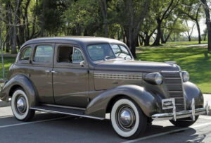
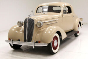
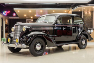
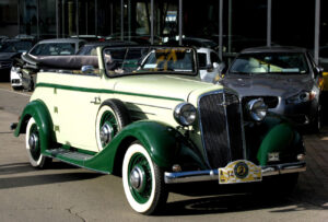
1934 – 1940
Here, the logo’s colour scheme changed to a monochrome black and white, with the wordmark enlarged and more modern in design. The badge became more masculine and also less flashy – which was in line with global trends at this point in history.
Here, the logo’s colour scheme changed to a monochrome black and white, with the wordmark enlarged and more modern in design. The badge became more masculine and also less flashy – which was in line with global trends at this point in history.
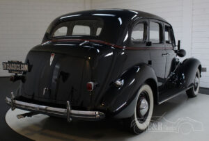
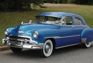
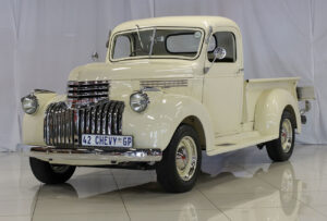
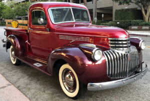
1940 – 1957
During the post-war period, the company decided to leave the monochrome behind and bring back the original blue and gold colour palette. The logo’s blue became brighter and more intense, with the bowtie framed in gold. The contrast in the white and blue branding made for a striking design!
During the post-war period, the company decided to leave the monochrome behind and bring back the original blue and gold colour palette. The logo’s blue became brighter and more intense, with the bowtie framed in gold. The contrast in the white and blue branding made for a striking design!

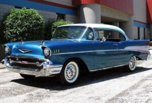
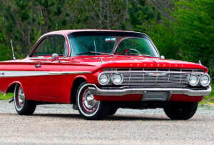
1957 – 1960
Chevrolet radically changed its logo in 1957. The colour palette switched to red and white, and the emblem was now placed on a rounded red backgrounded. The wordmark became italicised and retained its position on the bowtie – which now featured as a white cross.
Chevrolet radically changed its logo in 1957. The colour palette switched to red and white, and the emblem was now placed on a rounded red backgrounded. The wordmark became italicised and retained its position on the bowtie – which now featured as a white cross.

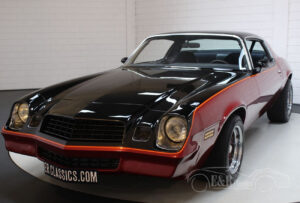
1960 – 1977
Chevy adopted a minimalistic approach in 1977. The logo – now monochrome – featured the bowtie as a thin, black outline with the brand name central in bold italics.
Chevy adopted a minimalistic approach in 1977. The logo – now monochrome – featured the bowtie as a thin, black outline with the brand name central in bold italics.

1977 – 1985
Once again, Chevy drastically changed their logo design in 1977, reverting back to a blue colouring and featuring a thin white frame within the bowtie. In addition, the bowtie gained a black shadow and the wordmark was no longer written in all uppercase lettering. The size was also reduced.
Once again, Chevy drastically changed their logo design in 1977, reverting back to a blue colouring and featuring a thin white frame within the bowtie. In addition, the bowtie gained a black shadow and the wordmark was no longer written in all uppercase lettering. The size was also reduced.
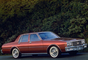
1985 – 2000
In 1985, Chevy’s badge comprised of a blue, outlined emblem which no longer featured the wordmark inside. Instead, the brand name shifted below and was written in a red, uppercase and rounded typeface.
In 1985, Chevy’s badge comprised of a blue, outlined emblem which no longer featured the wordmark inside. Instead, the brand name shifted below and was written in a red, uppercase and rounded typeface.


2000 – 2004
With the advent of a new millennium, the logo featured just the bowtie emblem. The cross, now three-dimensional in design, was dark red against a white background. At this point, the brand was synonymous with this symbol.
With the advent of a new millennium, the logo featured just the bowtie emblem. The cross, now three-dimensional in design, was dark red against a white background. At this point, the brand was synonymous with this symbol.


2004 – 2011
In 2004, Chevrolet brought gold back into their colour scheme, designing a three-dimensional, golden bowtie for their new visual identity. The emblem reflects the brand as luxurious and powerful.
In 2004, Chevrolet brought gold back into their colour scheme, designing a three-dimensional, golden bowtie for their new visual identity. The emblem reflects the brand as luxurious and powerful.


2011 – present
The current design was introduced in 2011 as a celebration of the company’s 100th anniversary. The emblem retains its golden colour, with an added silver frame. The bowtie’s design is still luxurious, but now with an emphasis on metallic realism. Like with previous versions, today’s logo also includes the wordmark.
The current design was introduced in 2011 as a celebration of the company’s 100th anniversary. The emblem retains its golden colour, with an added silver frame. The bowtie’s design is still luxurious, but now with an emphasis on metallic realism. Like with previous versions, today’s logo also includes the wordmark.

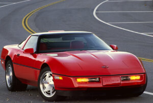
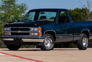
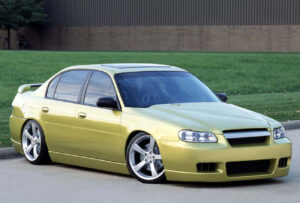
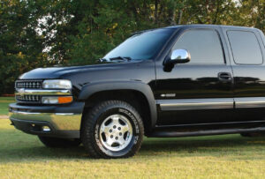
Chevrolet’s contemporary brand focuses on innovative technology, efficiency and impressive safety features.
Like Chev, Citton Cars is also totally committed to your safety.
Like Chev, Citton Cars is also totally committed to your safety.