The Evolution of the Chrysler Badge
Nov 2020
THE HISTORY OF CHRYSLER
CHRYSLER DESIGN BY DECADE
THE CHRYSLER EVOLUTION
The Evolution of the Chrysler Badge
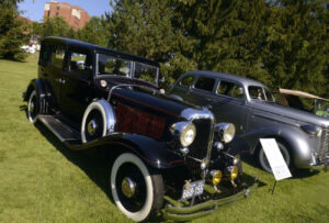
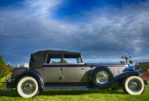
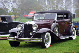
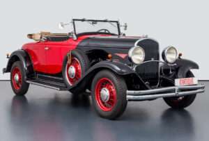
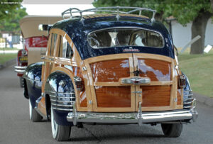
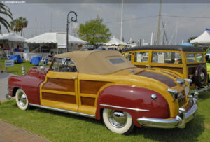
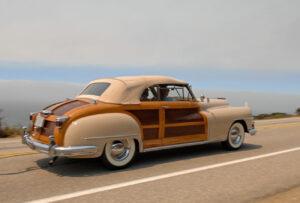
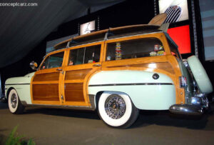
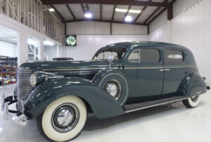
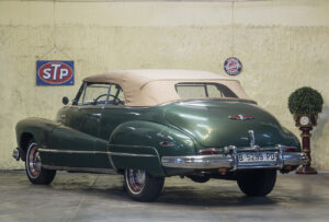
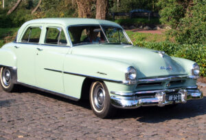
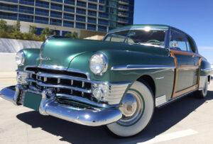
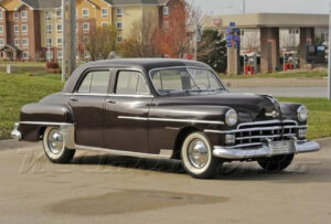
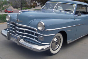
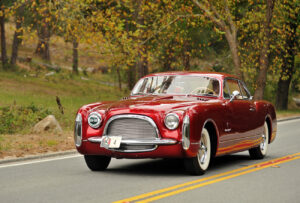
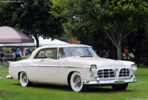
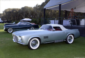
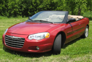
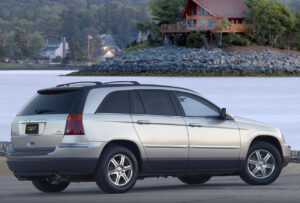
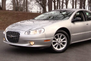
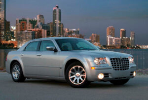
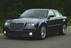
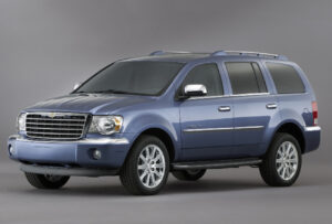
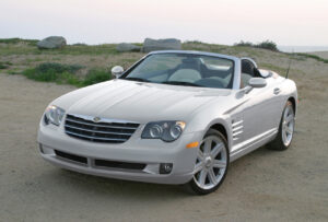
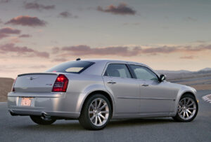
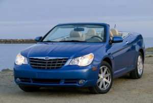
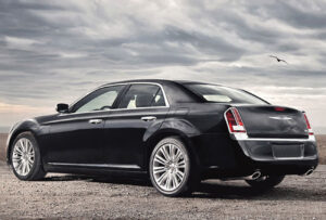
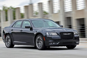
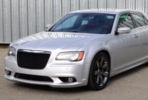
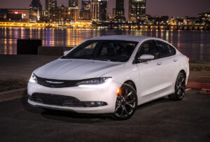
Chrysler is a legendary American car brand, which was established in 1925 and merged with Fiat in 2014. The company is one of the largest automobile manufacturers in the USA and named after its founder, Walter Chrysler, is an icon and one of the “Big Three” of the American automobile industry. During its history, the brand was a part of the Daimler group, then a completely independent company, and today it is a part of the Fiat Chrysler international group.
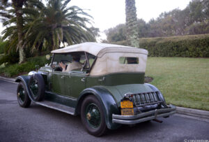
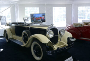
1928 – 1930
The original Chrysler badge was designed by Oliver Clark, and intended to be the radiator cap for the Chrysler Six. Clark took inspiration from Roman mythology, with the wings said to represent the speed of the Roman god Mercury. The seal on the logo was meant to represent a “seal of approval,” symbolising quality.
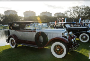
1930 – 1936
In 1930, the wings were removed from the logo and it became only a seal, changing its colour palette to burgundy and gold. It reflected luxury and quality.
1936 – 1950
In 1936, the brand sealed the wings together, featuring a silver colour with black horizontal stripes and a centralised logo.
1950 – 1951
The brand’s badge was dramatically changed in 1950, featuring a black shield with a gold lion holding a red crest. The experimental design was fairly short-lived, and the emblem stayed with the brand for just one year.
1951 — 1955
In 1951, the brand designed a new emblem and used it predominantly as a hood ornament. The design reflected a three-dimensional bird, symbolising speed and progress.

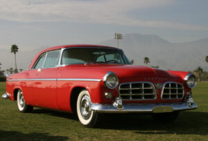
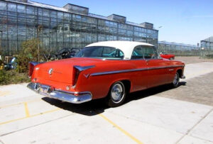
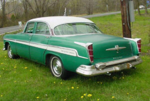
1955 — 1980
The brand created yet another emblem in 1955 representing a sharp V-shaped wings symbol. This solid silver badge was simple and stylish and represented the strength and confidence of Chrysler. This new emblem also introduced the brand to the era and design trends of modernity.

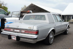
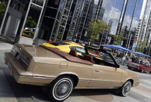
1980 — 1990
In the 1980s, Chrysler changed its badge from symbol to typography, opting for a text-based logo. It was composed of a modern wordmark in capital letters, with stylised lines and rounded letters. Both “Rs” of the nameplate were open, which added individuality to the brand’s visual identity.
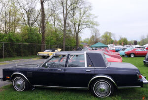
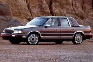
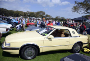
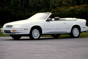
1990 — 1993
Decades later, the winged seal made a comeback to the Chrysler logo in 1990. The shape of the seal changed to oval and the wings were refined and elongated. The emblem looked sleek and sophisticated.
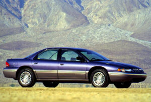
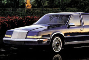
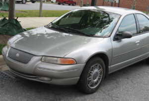
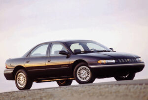
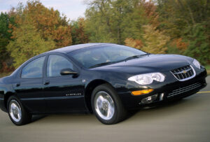
1993 — 2000
In 1993 the brand decided to give tribute to its roots and return the original seal logo, slightly modifying the colour palette with a blue ribbon on the nameplate.
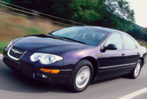
2000 — 2008
In the early 2000s, Chrysler started using the Pentastar emblem for its visual identity. It was placed on the left of the wordmark, which gained a more traditional typeface with bolder lines.
2008 — 2009
In 2008 the Pentastar changed its location and increased in size. Now, it was the central visual element, with the brand’s nameplate underneath.
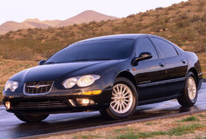
2009 — Today
In 2009, the brand altered the badge’s elements again, making a return to the winged seal. This version is a chic and elegant interpretation of its winged emblem predecessors. The seal was removed and replaced with a blue central area and a wordmark written in white. The three-dimensional wings took on smoother and fuller lines, which looks balanced and sharp. The blue and silver palette of the Chrysler logo reflects a professional approach and symbolises the brand’s longevity and stability.
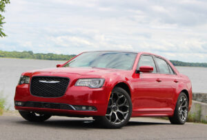
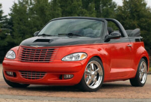
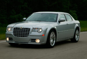
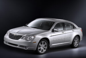
Citton Cars will hook you up with a top-notch Chrysler luxury car where inspiration comes standard.