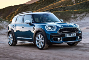
The evolution of the Mini badge
Dec 2020
THE HISTORY OF THE MINI
THE MINI’S LOGO EVOLUTION
The evolution of the MINI badge
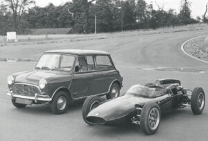
MINI has a history tracing back to the early 1950s. It is a brand that has gone through decades of change and innovation to what developed into one of the best-selling compact cars in the world. MINI’s history started with the collaboration between two key players in the British automotive industry namely the Cooper Car Company and the British Motor Company (BMC).
In 1956 British automakers faced a major slump in car sales on account the Suez Crisis and the rise of the German Bubble car. To fight off the fall in business Leonard Lord, then Chairman of the British Motor Corporation, approached Alec Issigonis to design a four-seater, BMC-powered small car.
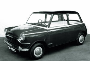
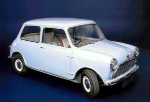
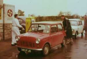
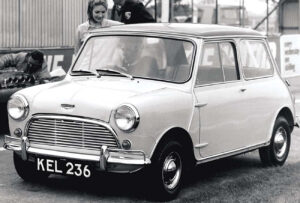
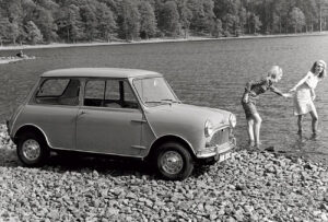
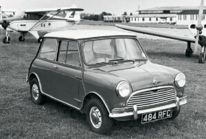
This resulted in the first models of MINI which were launched in 1959 under the brands Austin Se7en and Morris Mini-Minor.


The car was first conceptualised as an answer to the fuel shortage issue and the call for more efficient cars suitable for inner-city driving. It is reported that a BMC engineer dreamed of a small car to be placed outside the house of every working person. This idea and task of creating a new car was eventually given to Alec Issigonis in 1957.
1958 — 1962
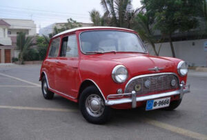
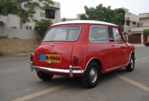
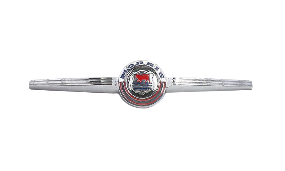
The first two MINI manufacturers were located in Oxford and Birmingham. The Oxford MINI was called Morris Mini-Minor, while the other one — Austin Seven. The models had different logos and no common style. The Austin Seven logo featured a cursive handwritten wordmark with a coat of arms above it, while the Morris Mini logo was a circle with two arrows on the left and right. The Morris logo became the base for the MINI emblem we know today.
1962 — 1969
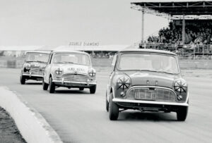
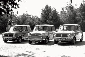
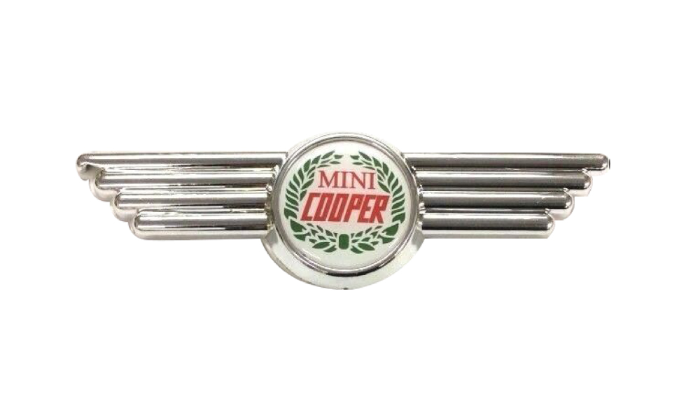
The company hired a new constructor, John Cooper, who created the famous Mini Cooper in 1961, which was followed by the new design of the logo and the new wordmark.
The 1962 logo featured a silver circle with red “Mini Cooper” lettering inside and two massive squared wings on both sides. That logo became an inspiration for the current one.
.
1969 — 2001
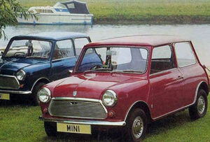
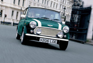
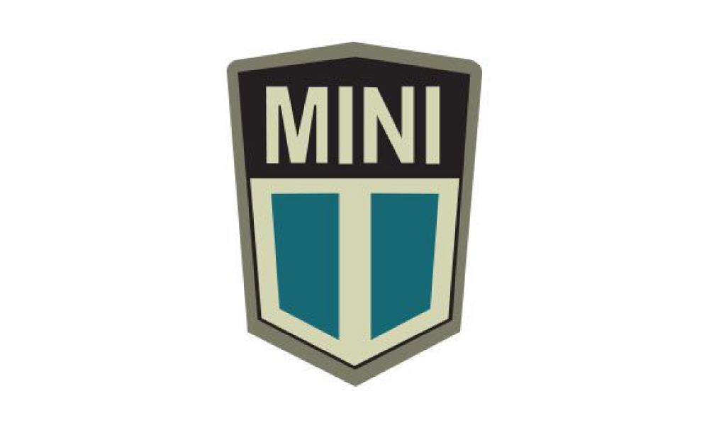
Rover Group (Leyland Motors) acquired the brand, changed its name to MINI and designed a new badge in 1969, which stayed with MINI for more than 30 years. The 1969 logo featured a hexagon, which is split into two parts: the upper one with a black background and a white bold wordmark, and the bottom one composed of two turquoise parts, separated by a white thick vertical line.
The solid silver framing of the hexagon made the colour contrast more intense and bright. The emblem’s symmetry added style and modernity, making the logo strong and remarkable.
2001 — 2015
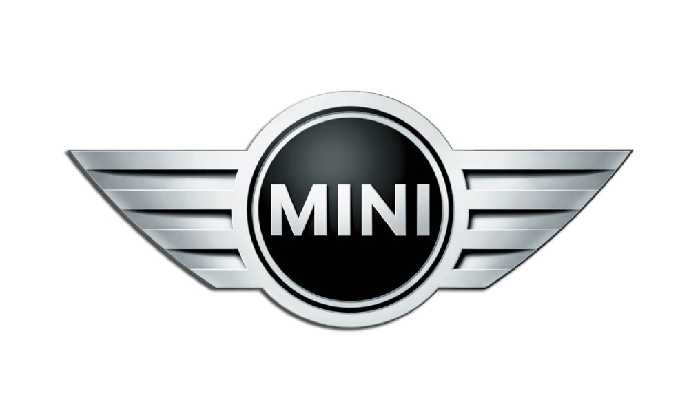
After the acquisition of MINI by BMW, the iconic winged logo was brought back and modernised. The 2001 MINI logo became a three-dimensional figure, which featured a black circle with a silver outline placed between two silver wings with sharp angles. The wordmark was executed in a sans-serif font with confident and neat lines. It looked simple and strict, making the logo stylish and powerful. The badge symbolises freedom and speed, the two most important qualities of the modern world and it celebrates the free spirit of the brand, its youth and focus on design.
2015 — Today
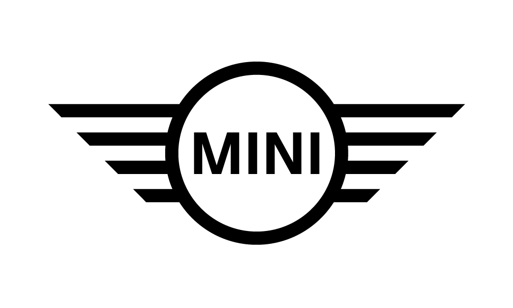
The logo lines were refined, and the colour palette switched to monochrome. The brand came back to a laconic two-dimensional emblem, accenting on straight and bold lines of the wings. It is a very strong visual identity for a car brand, which fully reflects the spirit of the company.
Popular culture, engagement and inspiration are words synonymous with the mighty MINI. Who wouldn’t want to be seen in an iconic MINI?
Citton Cars wants to excite, delight, and explore with our customers all that MINI has to offer.
